Tuesday, December 1, 2015
World of Nintendo: Ocarina of Time Link, Gravity Suit Samus, and Shy Guy
WHOA, I found almost another whole wave already! Thank you, Meijer! My local grocery store seems to be the only one on top of things. Come on in and take a look, folks! I guarantee you'll see toys. In here. 'Cause that's what this blog is about. Yeah.
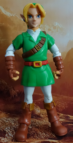
Sans a Tanooki Mario, I believe I've got the whole current wave of World of Nintendo figures, here. There's a repaint of Samus, and two new guys! One in particular is interesting: A whole new Link! I think he's the best place to start, don't you?
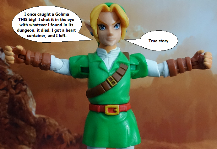
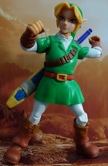
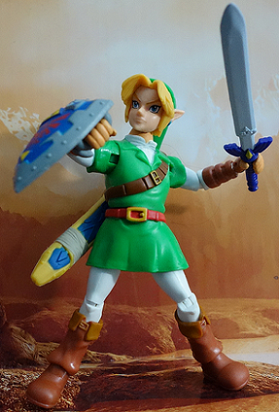
I'll be up front with you: This new Link is hit and miss, in entirely different ways from the last Link. What we're looking at is Link in his design from Ocarina of Time, on the N64. Hopefully that is obvious, because honestly, I don't think it does that bad a job of looking the part. Some things are just a bit...off. It's a little more obvious when you've got him in hand, but his head seems too big (not by much) and his legs seem too thin. Some proportions are off, is what I can say for certain. Just can't say how much.
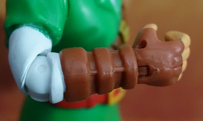
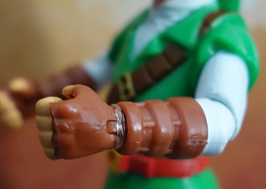
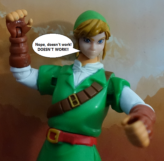
Next, we're looking at similar articulation to the previous Link, but the joints in the arms are thicker and feel less jangly. The wrists are also tightened up...on one arm. The other arm had a SUPER loose wrist, so I wrapped a clear rubber band around it.
Otherwise....come on. Do we really need those wrist joints, or are they just trying to follow some standards of the day? 'Cause I feel like they just get in the way. You won't need them on the shield arm, and the sword arm (if the wrist is loose) will just flop around at the wrist for no good reason. There's very few poses that require Link to need that movement at the wrist, beyond just turning it.
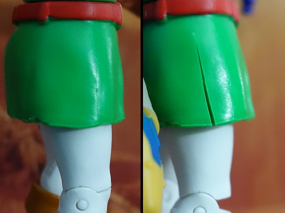
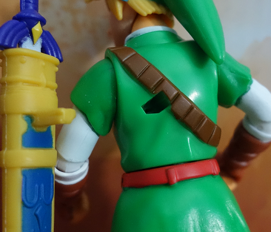
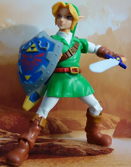
One big thing is that Jakks tried to fix the skirt problem! Yay! There's even extra skirt underneath so that you don't see the legs when you push them out.
...excuse me, IT. One leg. When you push one of the legs out. The other side of the skirt is completely closed, pretty much negating the improvement they made.
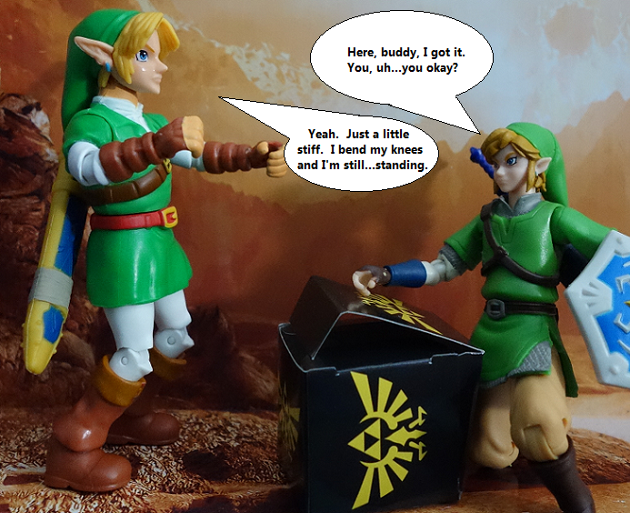
SOOOO...I cut it again. It helps, but the skirt is long enough to pretty much make any sort of crouching pose impossible.
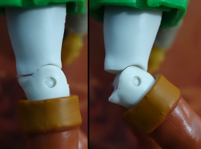
But then again...
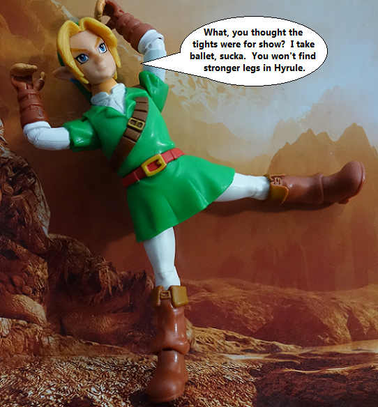
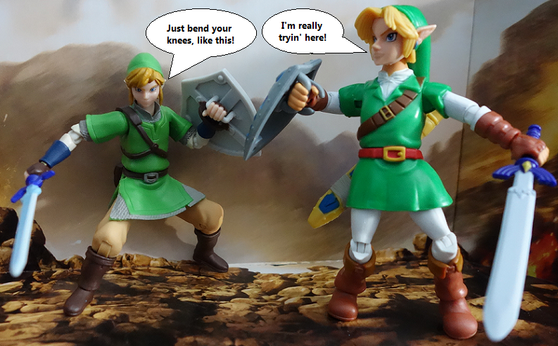
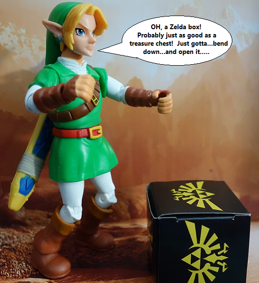
...so do the knees. The knee stop at less than a 90 degree angle, while the previous Link got 90 and a little more (allowing for a kneeling pose, if you cut the skirt). The knees, in tandem with the skirt, make any sort of extreme poses impossible.
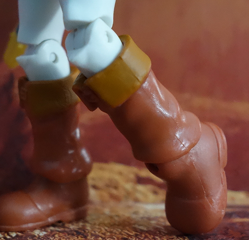
Which kinda sucks, 'cause he's got some nice ankle articulation! He can even tap his boots like in his waiting-for-you-to-do-something animation.
On the plus side, the arms are pretty unrestricted and allow for some nice poses. They move all the way outward and forward 'n back and all that.
When we move up further, though, we see Link fall prey to the old fashioned useless ball joint in the neck. It's so high up in the head that you only get side to side movement, when a larger ball and socket could have given us some more range! Take a look at what other toys are doing, Jakks. Get your homework done!
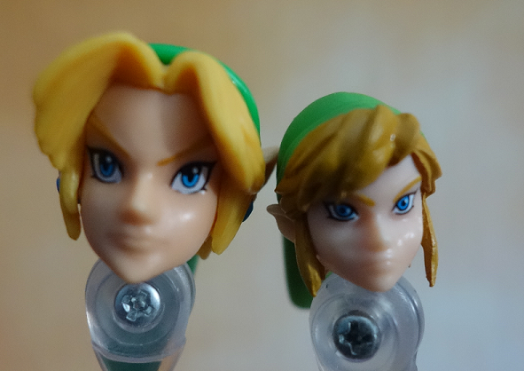
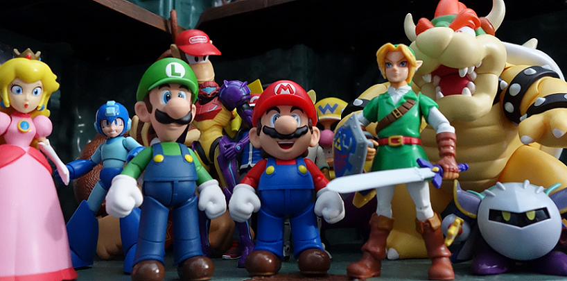
Now, I felt like the previous Link was a TAD too small. He was perfect G.I. Joe size, but he didn't quite line up with his Smash Bros brethren. You can see that Jakks tried to remedy this, but as I stated: The head is a bit on the large side. It looks better in the pictures (to me) but in-hand it feels off (or something else feels off? Hard to say).
Plus, this time, there's no cut on the hat, so Link's long hat tail will keep hitting the sword sheath and knocking it off. The previous Link does that too, but at least I could take the back of the hat off and shove it on sideways ('cause it's not made to move, but you can anyway). A larger ball joint in the neck could have fixed this, or allowing the back of the hat to turn.
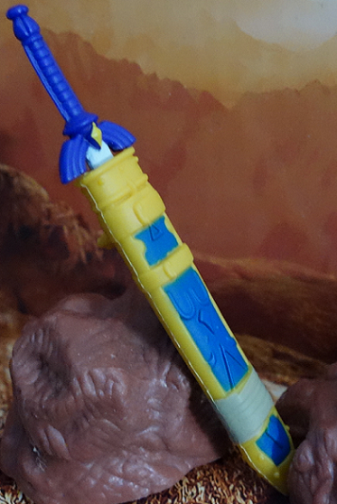
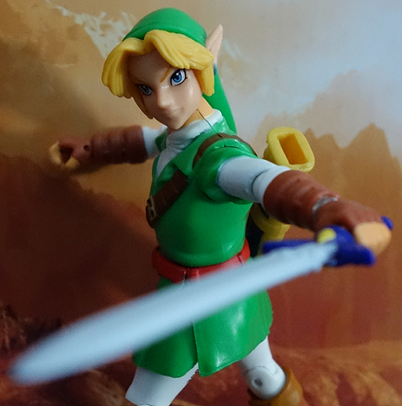
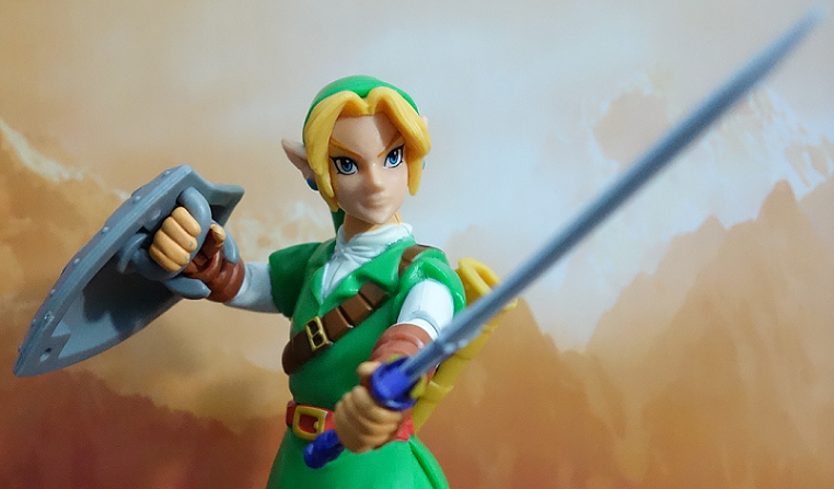
On to accessories! We get a more "toon-ish" Master Sword to match Link's brighter colors (which are indeed brighter, but my never-ending battle with terrible lighting makes him out to be darker than he really is). Personally, I like the design better, but the blade is a FLAT gray. Bleh. Would have liked a silvery wash over this color to make the blade glow a little. I realize Ocarina of Time Link didn't quite have the details that later Links do, but that's no excuse for this ugly blade.
Beyond that, the actually sculpt is cool, and would top the previous one if it wasn't for the blade paint.
The Master Sword comes with a sheath that secures to Link's back better than the previous Link's, but still pops off when you turn his head right. You can shove it on to get it to stay, but I would have liked the sheath to snap in, rather than just slide in.
The Master Sword slides in firmly, though, and won't fall out.
The "secret accessory" is about as secret as last time.
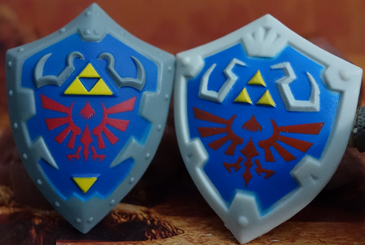
It's the shield, of course! What else would it be? The only difference from the previous Link's shield is some bolts, a darker gray color, and less width. Honestly, I think it's a bit too small. I don't know if that's because it has to fit in that box or what, but if that WAS the problem, then they should have just packed him with a bigger shield and put the Ocarina in the secret box. Would have been a nicer surprise!
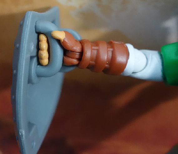
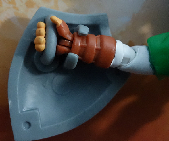
The shield is made for his right arm (since Link is a lefty - he was only made a righty in Skyward Sword) and is a bit of a pain to get on his arm (though, not as much as the previous Link's shield).
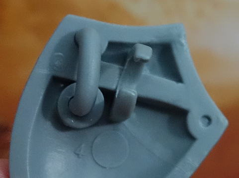
The problem is sliding his thick fingers through the handle. It'll fit! Just have to put some effort into it.
So...there's a lot of complaints here. Nonetheless, I somehow end up liking this one a little better? I guess because the previous one has it's own problems, and this one just has different problems. There's technically no improvements - just sideways movement. If I gotta choose one or the other, well...I have to go with the new one because of size and looks. I'm happy to have both, since the previous Link lines up with my Joes, but this new Link looks MUCH better with his Smash Bros crew.
I could see how this one might be an utter failure, to some. I could write a laundry list of things to watch out for and fix and send it off to Jakks, honestly. Better neck-ball-joint, cut the side-to-side wrist articulation, make sure the knees move back far enough, DO something with the dang skirt to allow the legs to move forward, etc etc.
...but that's just the collector in me talking. If I let the kid in me talk: Well, I've seen a LOT of worse 90's figures, ya know? This is dang nice, if it were a 90's figure! He infuriates me as I try to pose him, but delights me when I play around with him. There's certainly no excuse for some of the problems, this day in age, but I can't help but like the design better and appreciate the new size. Something is certainly off, but not enough to bother me.
I can't call this one a must-buy, but I can't really steer you away, either! Take a look for yourself, if you see it in stores, and make your choice.
Now, I was gona make this just a post about Link, but there isn't much to say about the other two, so I decided to shove 'em all in one post.
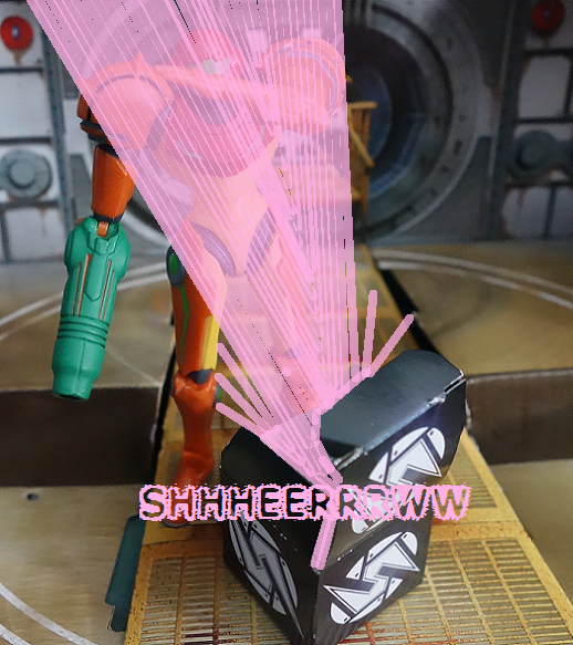
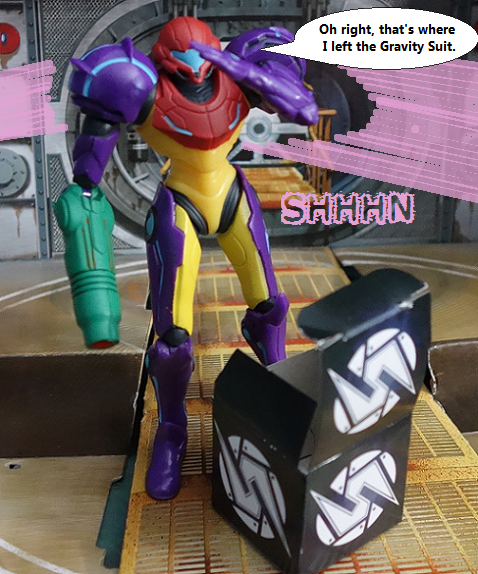
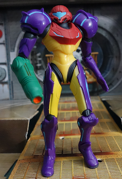
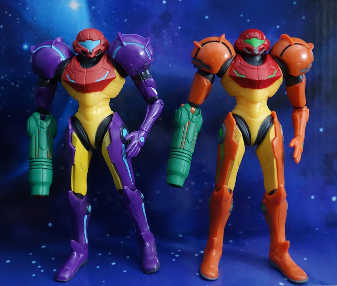
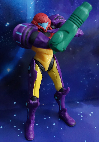
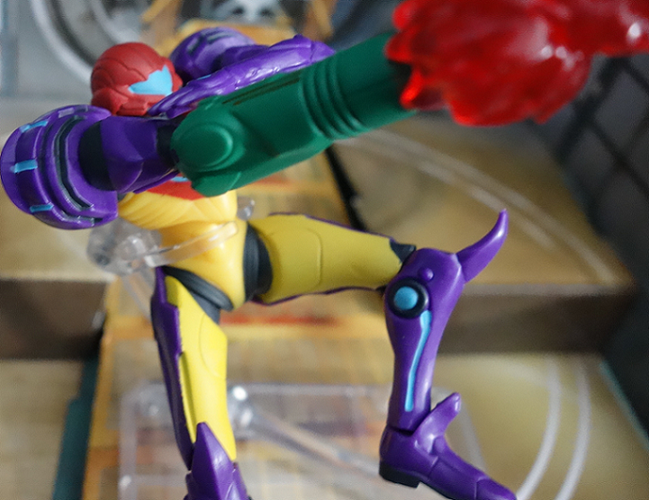
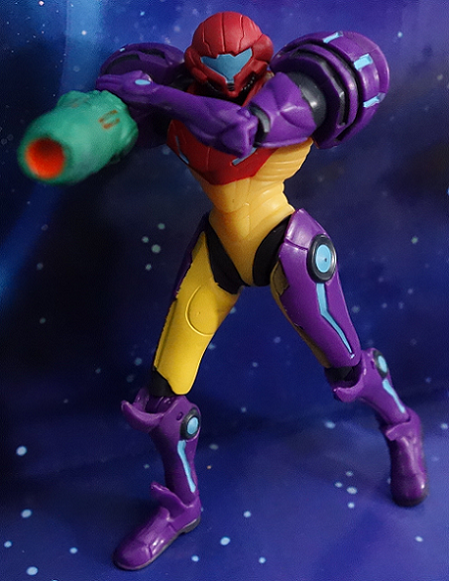
Gravity Suit Samus is a repaint of the previous Samus and comes with all the same articulation and pluses and minuses (and accessories! Her Morph Ball form is here again, but in purple). I love the look, but she could use some work. The shoulders need work, and the hips could work better (as well as the ankles). Also could use a ball-jointed neck. Maybe a fist, rather than an open hand. You can check out my first review, for more details.
Otherwise, I like this one in the same way I like Link: She works in older ways - 90's ways - but falls a little short nowadays. I still like her, and if you did too, I'd pick up the Gravity Suit as well. How else is she supposed to move under water?
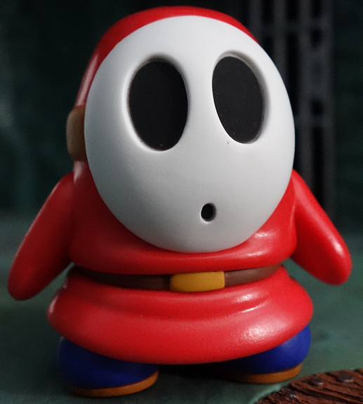
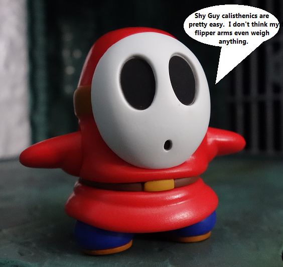
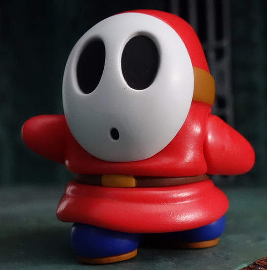
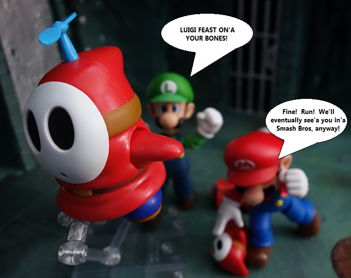
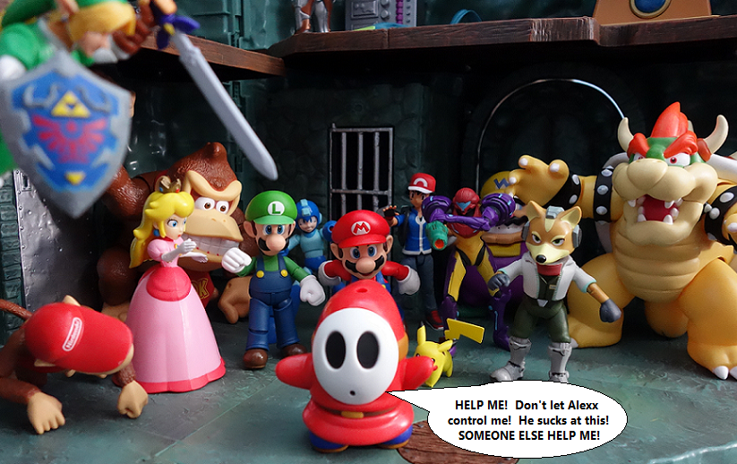
Final figure is another gigantic version of a normal enemy: The Shy Guy!
Much like the Goomba in this same scale: He's a little big. There are giant Shy Guys, in certain cases, so it'll always find a place somewhere in your collection. Plus, it's just a cool freakin' Shy Guy!
His arms move forward, back, and side-to-side. There's also a waist swivel and his feet kinda...shuffle side-to-side, but that's more of a result of construction than an articulation point. The arms are what bring it home! They didn't have to do that, but they did, and it adds to the Shy Guy's cute factor exponentially. It's science, probably!
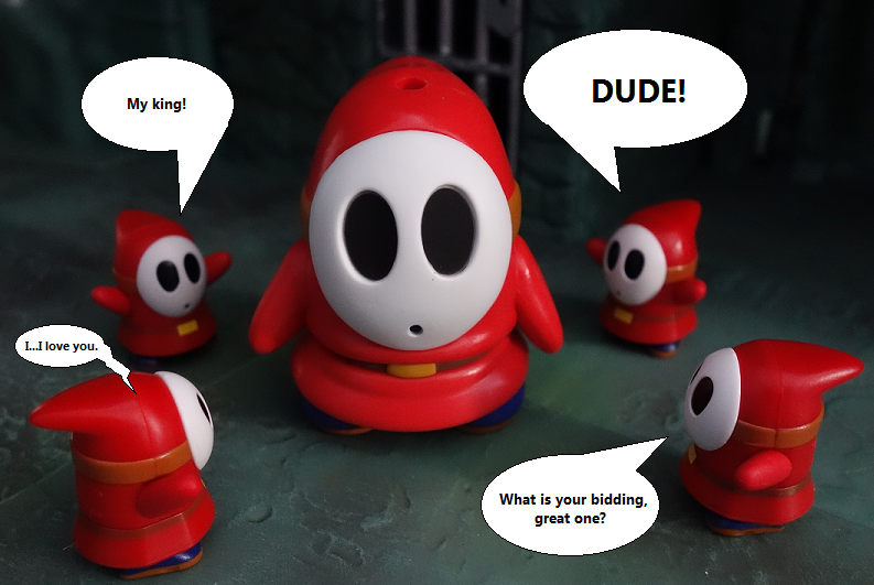
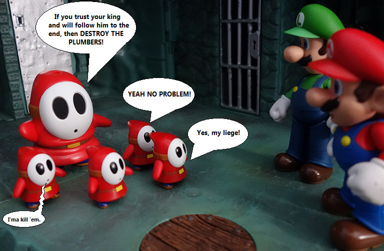
There technicality is still no normal sized Shy Guy (compared to WoN and Figuarts), since the K'Nex Shy Guys are a little too small and this new one is a little too big, but MAN I don't care! Look at these little guys!
Shy Guys are awesome.
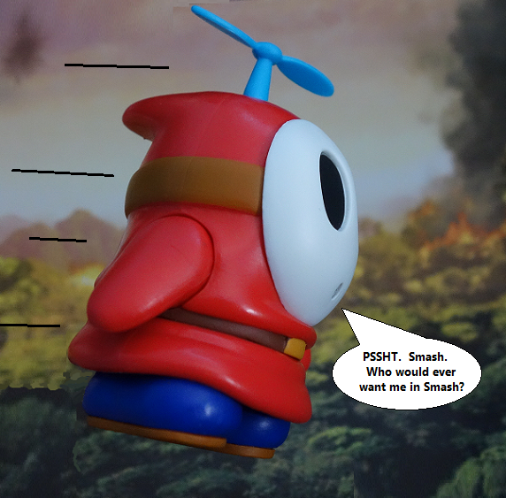
The BEST thing about this Shy Guy is that the secret accessory is a propeller! That means there's a hole in his head to plug in the propeller, but who cares? HE HAS A PROPELLER!
If you're unfamiliar: Shy Guys can sometimes have propellers in the game "Yoshi's Island." They fly around and hold stuff or just lazily float for no good reason other than to be Shy Guys in the sky, guys.
The Shy Guy is technically too big and doesn't really match anything, but I don't care. Buy it. It's the best, people. Especially if you just want a Shy Guy for your desk! This is perfect. It's perfect all around. I love it.
So lets do a quick run down:
LINK: I can see a lot of unhappy people with this one, but try and give it a chance. There are some problems that a company like Jakks should already be aware of, but the figure can still bring some joy. If not for you, then perhaps a kid you know? I KNOW kids will get a kick out of him!
GRAVITY SUIT SAMUS: Get her if you like the previous one! If not...it's the same thing, so avoid it again, I guess!
SHY GUY: Buy it! Seriously!
That about does it for another round of World of Nintendo. Jakks, if you happen upon this teeny little corner of the internet: Consider what I say! I know you're capable. Just take a look at some standards of articulation and consider what needs to be there and what doesn't need to be there. This Link is on the right track! Just needs some tweaks.
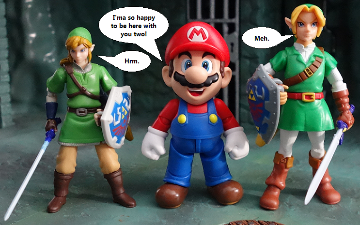
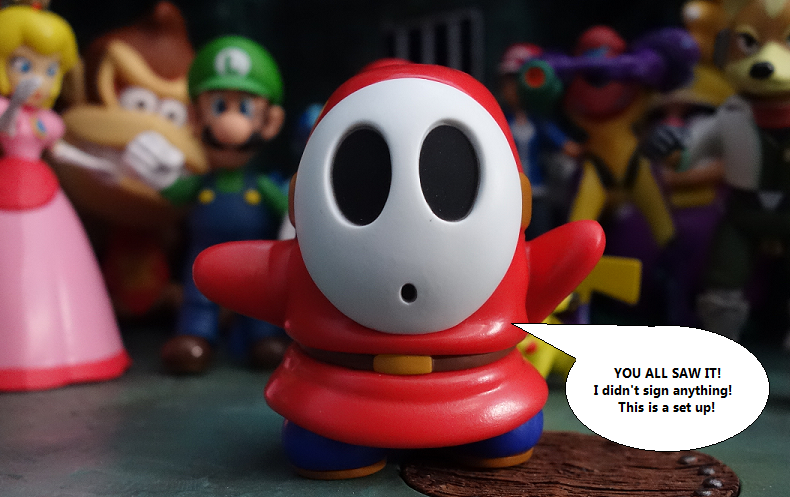
Our Smash roster is filling out nicely!
Subscribe to:
Post Comments (Atom)












nice review. i just got link myself and that shield is a pain in the ass. also i'm indifferent to this link. i would prefer that he was the same size to keep that timeline consistent but, so long as shiek and the future zelda fits his size i won't have any problems. also i hope they remake the skyward sword link to fit this size as well for the sake of height.
ReplyDeleteI'm really liking the new size, so yeah, I'd be up for a remake of the first Link. On the other hand, I DO still like the previous Link for being Joe sized! I just like this new one more, for lining up better with the other characters. Hopefully this is the new scale for anyone associated with Link.
DeleteSo awesome!
ReplyDeleteI just got a notice from BBTS that this wave should arrive soon. I've got it preordered so it's nice to no I won't have to do the hunting I had to do with the current wave.
Glad you liked them! I'm still sorta afraid there's gona be a lot of backlash for poor Link. He's got some problems, but I like him, in the long run.
DeleteBBTS is really a time-saver, in that respect! I should be going back to them instead of leaving this toyline up to fate.
Oh snap. I need that Shy-Guy. SMB2 is my favorite Mario game. I'd be in heaven is they ever made Wart and Tryclyde.
ReplyDeleteAlso...killer review as always Alexx.
Thanks man! Yeah, I could totally go for a Mario 2 based wave. Just, ALL Mario 2. Everyone can come with various turnips 'n things that they pull out of the ground, and then they can make the end-of-the-stage bird mask thing that had BETTER have an opening mouth!
DeleteGonna try and pick these all up, all look great fun. I missed out on Link first time, so Ill reconcile myself with this one. Samus, so buy. Shy Guy was my first Mario Figure, seem right to buy this one a make a link to the past! (pun entirely intended)
ReplyDeleteShy Guy for smash bros.... YES!
Pun entirely appreciated!
DeleteYou won't be disappointed with the Shy Guy. You'll be the belle of the ball! Everyone will be like: "Oh, Mr. Huckvale, I simply MUST know who is your partner for this evening!" And you'll be like: "It's....it's a toy. Was that not obvious?" And it'll be awkward for everyone.
Got my hands on Link and I must warn you, Don't look up his skirt! Link has a really perky ass for some reason and it worries me!
DeleteDamn right he does! You don't briskly jog all over Hyrule and not develop a fine ass! Chances are, he falls on his butt every time he jumps down one of Hyrule's famous and numerous holes in the ground. I don't know how else he survives so many falls.
DeleteStill don't really like the JP Nintendo figures...but I need that purple Samus
ReplyDeleteFair enough! And yes, you do. I mean, I REALLY need them to rethink those shoulders, but as a basic toy, she rocks.
Delete...but you also need that Shy Guy. I'm just sayin'.
I ordered 2 Shy Guys this morning after your review Alexx. I need a pink one now. And a Snifit...and a Mouser...and Tweeter...well you get the idea.
ReplyDeleteIf they make a Snifit, so help me, they better make that thing shoot a little ball! I need a Snifit that shoots at people.
DeleteFor the record Shy Guy is actually in scale. Do your home work....
ReplyDeleteHey now, don't submit something to The Record without evidence! Fair enough, though: I'll do my homework!
Deletehttp://img.photobucket.com/albums/v140/Alexx1083/0%20Video%20Game%20Toys%200/Shy%20Guy%20Homework.png
Taking into consideration that my picture isn't perfectly head-on: It looks like our Jakks Shy Guy comes up to about Mario's ear, while the original SMB2 Shy Guy comes up to about Mario's neck. Granted, many different games have come and gone since then, and I'm sure they've changed the size here and there. Heck, this might be a good size comparison for Mario RPG, honestly, because I think the Shy Guys are a bit larger in that game (and slightly elongated, like the figure in question).
Basic thing is this: I feel he's a BIT too big. Not ridiculously so, and certainly not enough to make this not worth it (I think I made it obvious that I LOVE this figure), but still just a tiny bit too big. They kind of have to make it bigger, so that it fits within the price range of this scale, so I'm not knocking them for it. Just an observation.
Man, I should have waited to get this Link instead of the previous one! I had no idea they were making him.
ReplyDeleteAs for the pictures, and excuse me if you already know this, I have a feeling that the issue is the white balance.Check this out: http://www.digital-photo-secrets.com/tip/1354/how-to-get-the-perfect-white-balance-every-time/
Thanks! I'll have to try that out and see if it changes anything. I know I need better lighting all around, at some point. It was great, in my apartment! Now I'm in this little room with a light above and one to the right. I was tired of both, so I have been using just the one to the right for the last few posts. It softens things a bit and gives me a better color, but everything is muted because it's so dim in there. I can adjust the brightness, but sometimes that makes the whites WAY too bright. I'll have to see if the advice in the article changes anything. Might work until I can get myself a REAL lighting setup.
Deletei loved ocarina of time and the 3DS version, this figure is my definitive link, he's in scale and i can use him with my D-arts figures and my jazwares sonic figures
ReplyDeleteGood to hear! Yeah, I'm much more pleased with the size of this Link, versus the last one. I would like them to revisit it in terms of articulation, but as a basic toy and for scale with other figures: He's pretty nice!
Delete