Details, details! In our next installment of the way-too-long review of MotUC Castle Grayskull, we take a look at the details of the outside of the castle. Join me, won't you?
Oh the magic those Four Horsemen can spin! Do you remember EVERY DETAIL about the vintage Castle Grayskull? No? Well I don't blame you, I mean, why would you? What are you, an art critic? You ARE? Well you're in luck, because LOOK AT THIS MAJESTY:
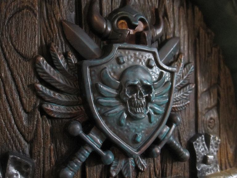
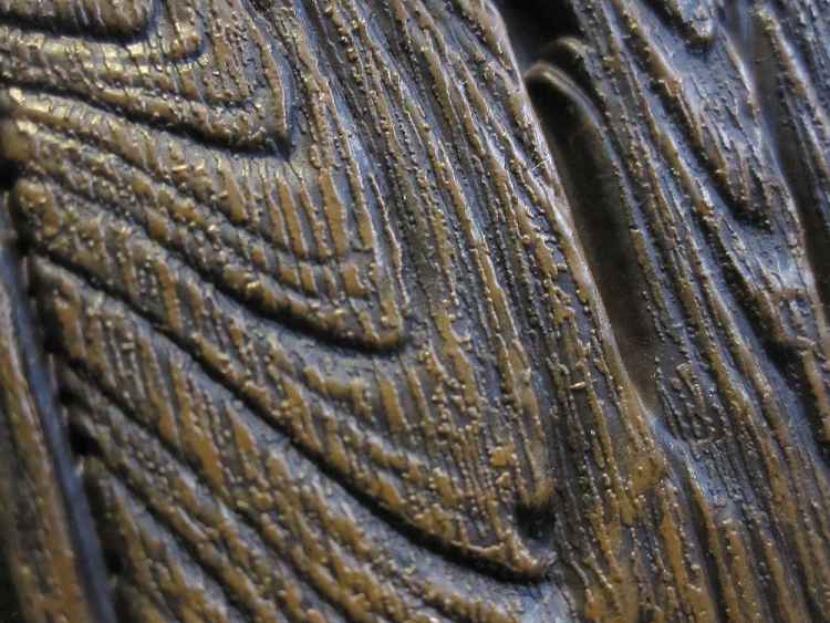
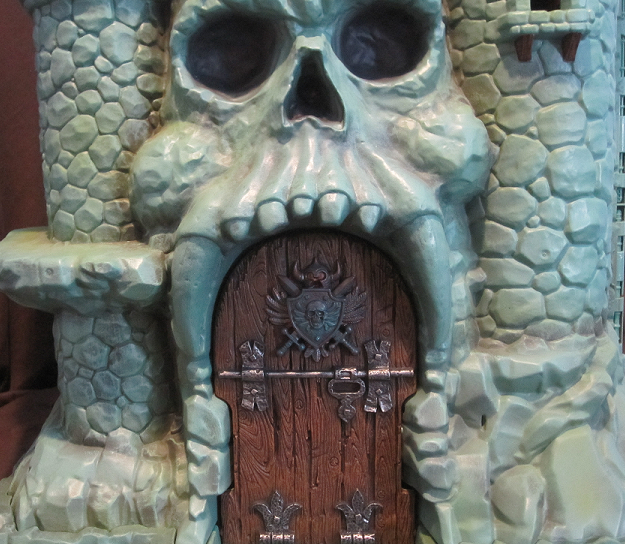
Near or far, that door is a masterpiece. I want to kiss it, and frequently do, when people are watching. I want everyone to be aware of my love (don't worry, there's no video of that). I may not have been aware of every little detail on the vintage castle, but I do remember that door! It's great to see the realistic wood grains and the pitted metal of the hinges and and bolts. The crest is even painted with a bit of green to give it that old copper look. I love this door. I want it as the door to my house - I don't even need a castle with it (but I certainly would appreciate a castle, lemme tell ya).
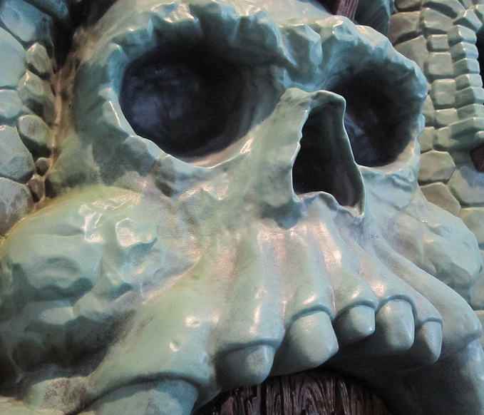
And it wouldn't be Grayskull without the skull. We're back to the old fashioned neutral skull - unlike the 200X one that was just pissed. The classic skull wards off the denizens of Eternia not with fear, but with foreboding. You know something could go wrong, if you tried to get in there. The skull says that much. But the basic neutrality of the skull face gives you no feedback beyond the plain idea of death. It's not angry, it's not even looking at you. It's staring off into the distance, as if you weren't even a concern. You can't touch this castle. You weren't meant for it. Be gone.
Now this is a remake of the vintage castle - BUT - it's also got some new additions! You see, there were a bunch of details on the prototype of the vintage castle that never made it to production, so they added them in, here.
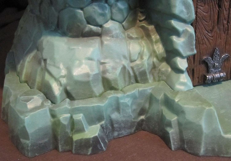
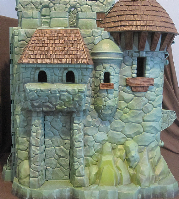
In the proto, they planned to have an extra cardboard "moat" around the castle. They didn't add the same thing, but they did build up around the castle edge, to give it a bit more bulk at the bottom. You also may notice a "pawn" at the top of the skull's dome. They added this as well!
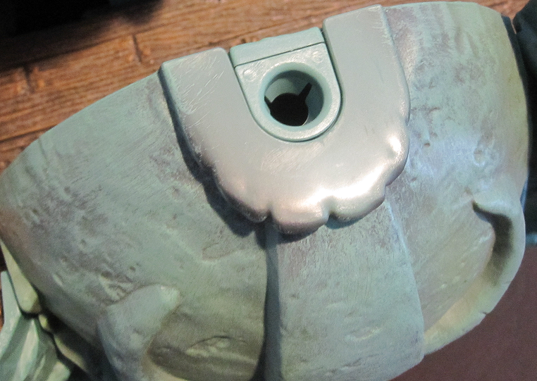
But, of course, if the prototype look isn't your thing, you can remove the pawn for the classic look.
You'll be left with a hole on top, though. I thought it would have been cool to add a little flat piece to cover the hole, but it still works as-is. Heck, though: I like the pawn! Doesn't look out of place one bit.
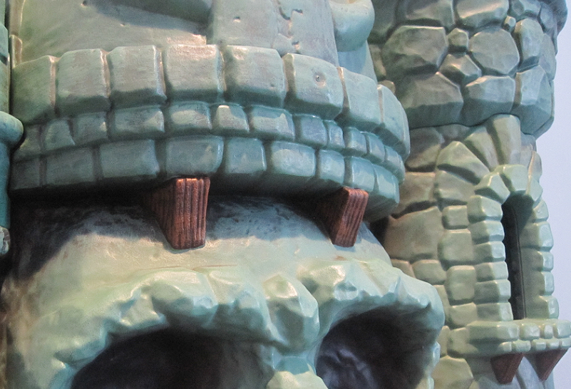
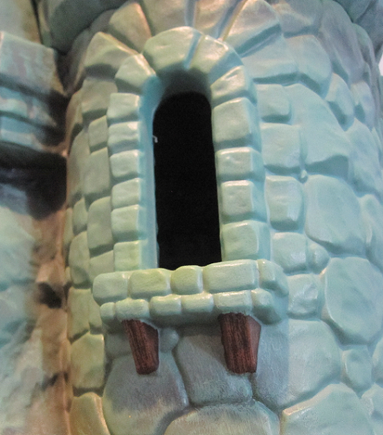
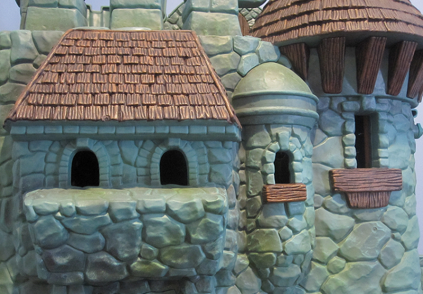
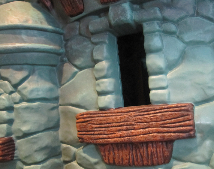
Another classic detail I've always liked is the little window. It sticks out to me because of an old MotU flashlight I had. It was designed to look like a tower from Grayskull, with the light emitter looking like the circular parapet and the on/off switch looking like that window. I always liked that!
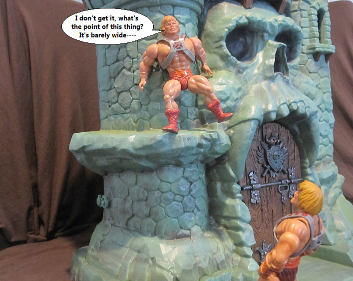
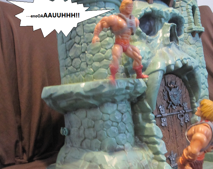
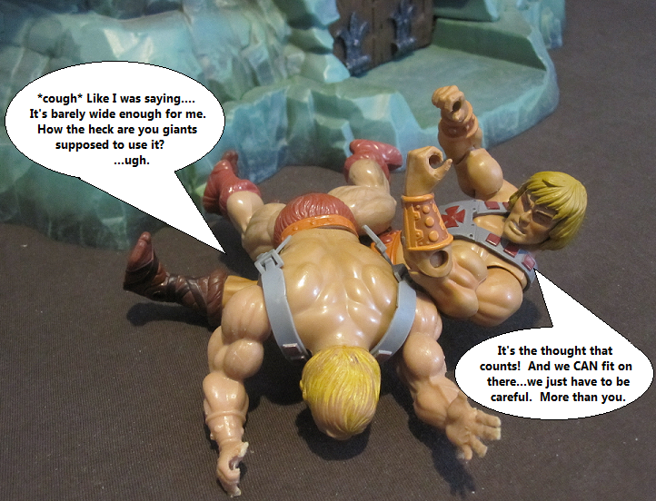
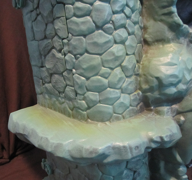
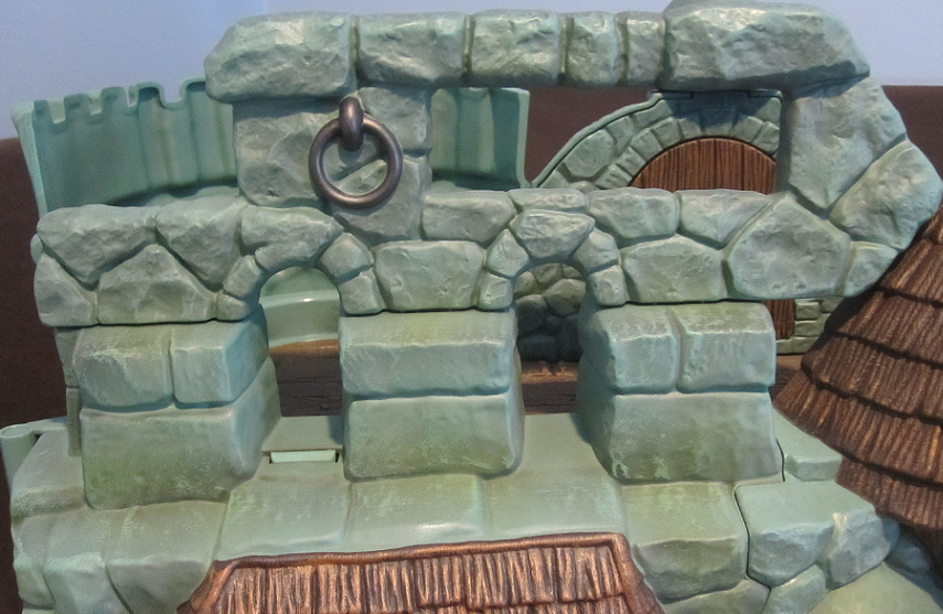
The ledge is another detail from the prototype. I love it, but it is a bit too small to reliably pose figures on it and expect to leave them without falling. It's more of a play-value kind of thing, because I'm sure it would be fun for kids to use. Also, it just looks cool.
Now lets move on to the back and check out that sweet be-hind.
Now the back is where the little details are at! I loved that they added to much to the back of the 200X castle. This one had a bit less, but they've brought out all those original details, made the wood parts wood-colored, and even made the tiny window into a real one! They also turned the top area into a full handle. It's optional, meaning: You don't have to put it on, but if you DO, you can't really get it off easily. Personally, I think it looks naked without it. They molded it to look like part of the castle, and I think it is perfectly successful to that effect. Especially since the handle half has the top of the windows, completing the original look of the back.
There is one particular feature about the new back that REALLY gets me, though.
THIS IS GREAT. I mean, the secret door in the back is part of the prototype, but the recessed section on the back of the vintage castle still looked like a door, ya know? I always thought of it as such, and when I was a kid, I still used it as a secret back entrance, even if it didn't do anything.
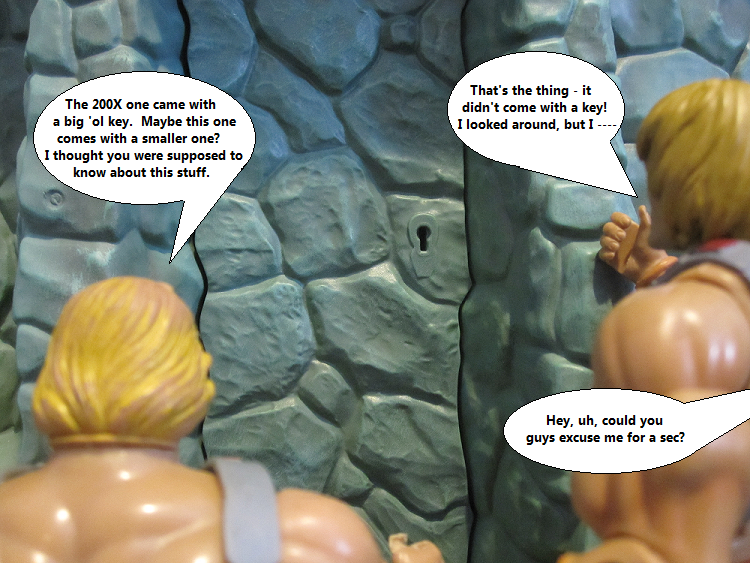
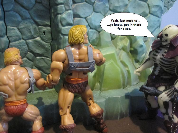
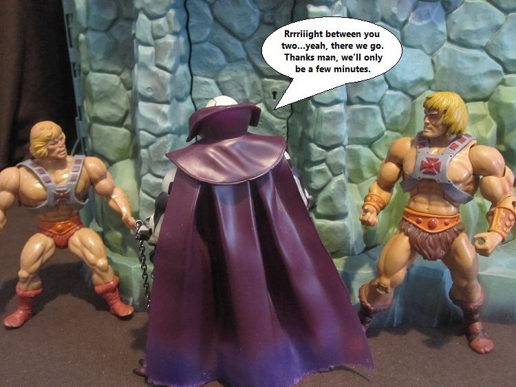
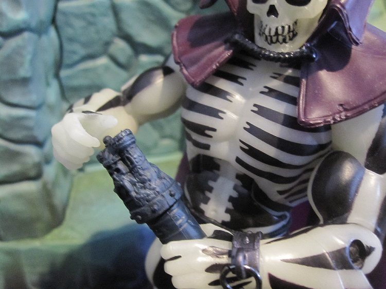
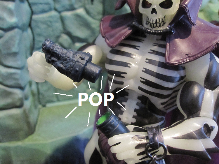
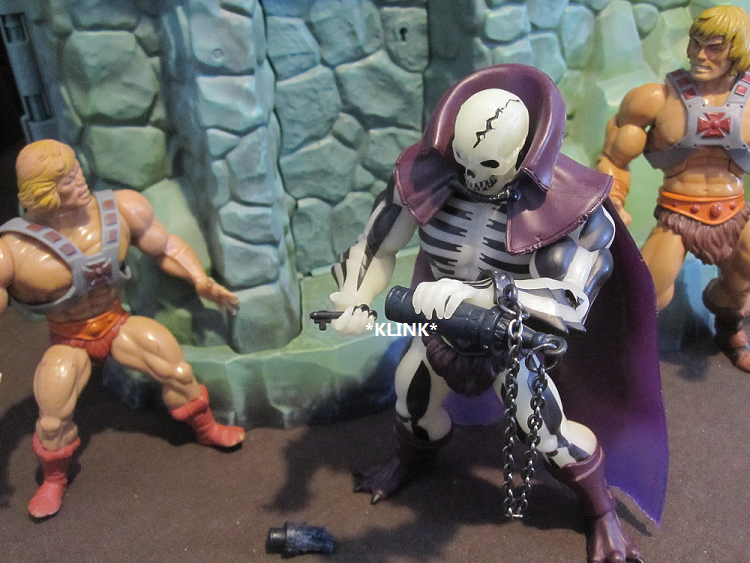
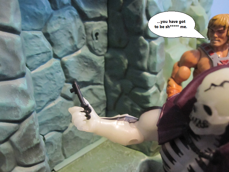
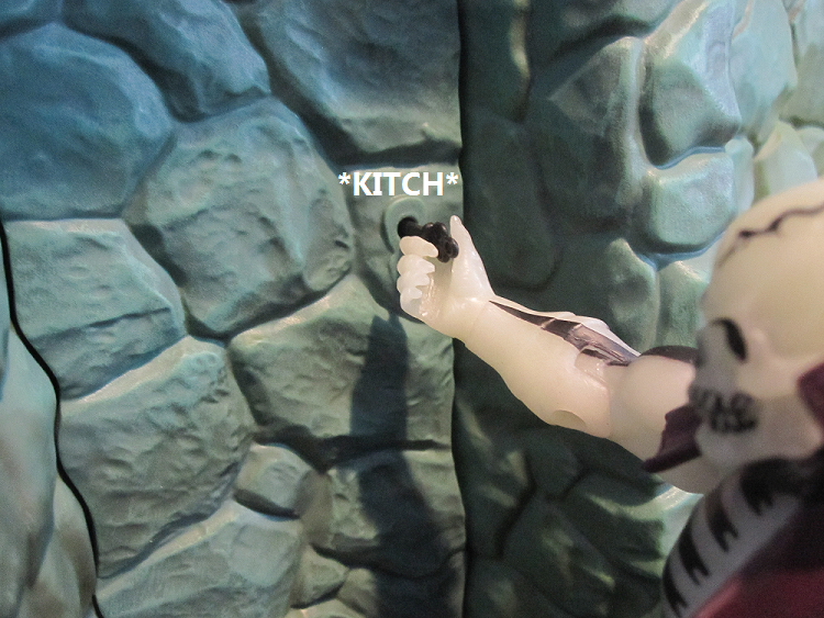
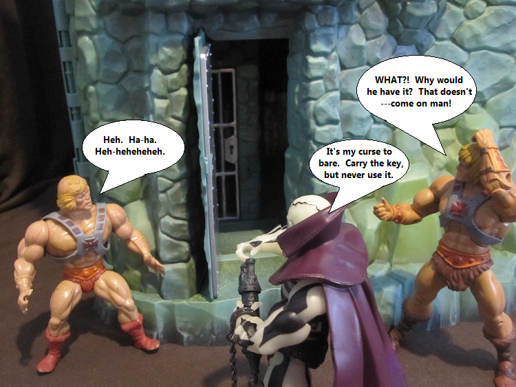
Now it does! Not only that, but they went the extra mile and added in some functionality with Scare Glow. If you weren't aware: Scare Glow was given an extra feature in the form of a reliquary that contains a key he's not supposed to be able to use. It's his curse, in death, to protect the only other way into the castle, though he (nor anyone else) can get at it or use it. WE can, though, and the Horsemen worked to get that key to fit int the keyhole on the back door! I LOVE THAT. I love it so much. Plus, if you're careful, you can sorta use the key to get the door open, so it works! If you're careful. CAREFUL.
I don't think I need to say how much this adds to the play value. Secret entrances should be standard for a playset. Especially a fortress of mystery and power!
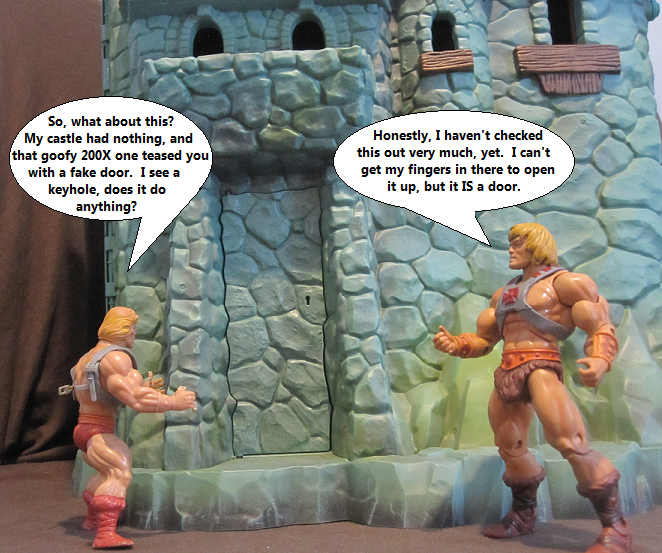
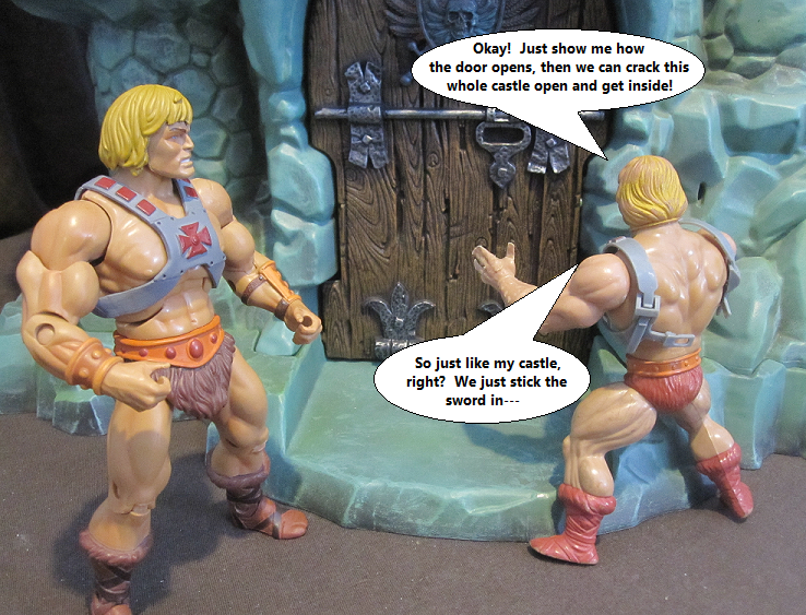
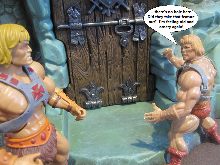
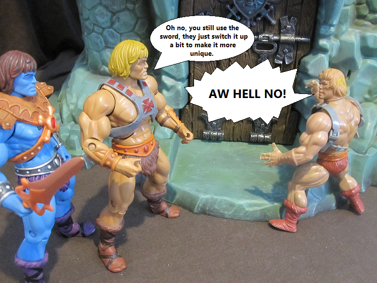
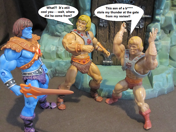
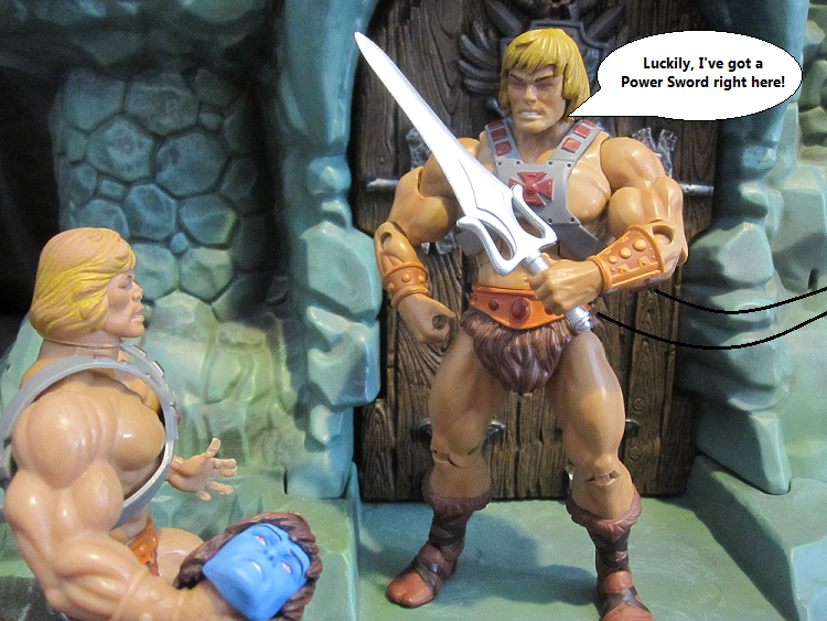
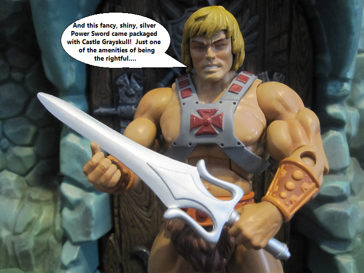
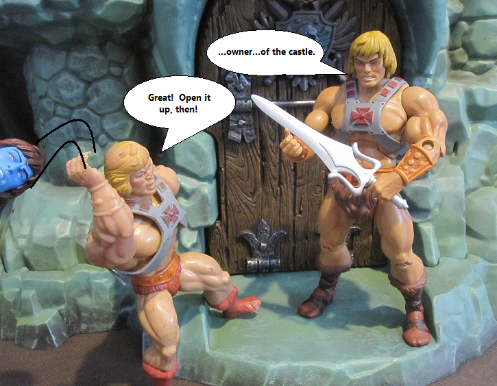
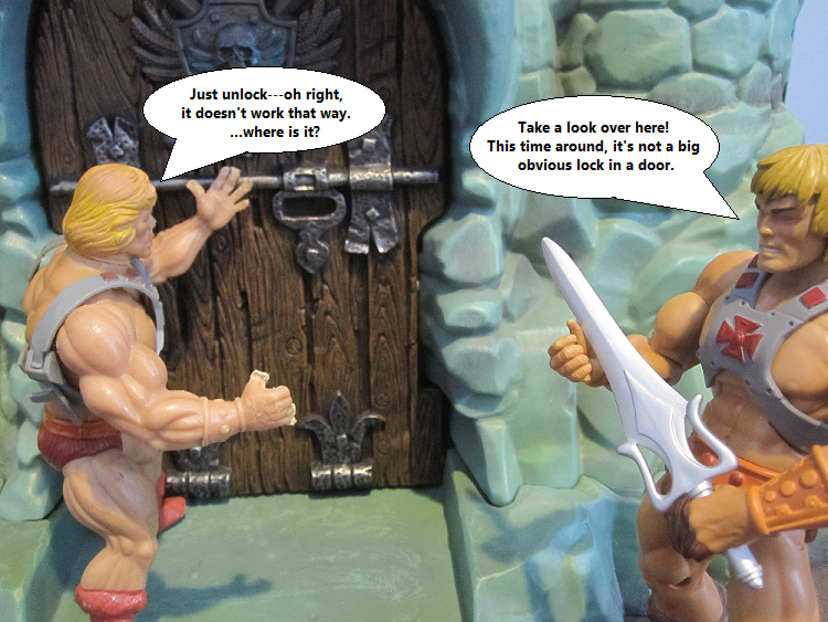
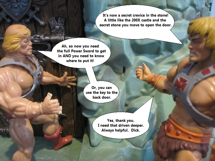
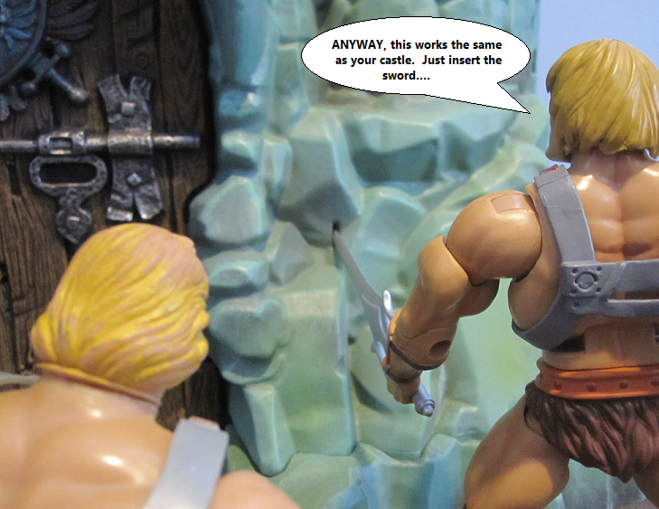
It was pretty simple on the vintage castle: Get the swords together, and shove 'em in the lock on the door! Now they want to make it a little more....secret. Mysterious, ya know? I'm not gona blast you with more words in caps about how much I love this as well. It's a no-brainer improvement, unless you somehow hate happiness and cool things.
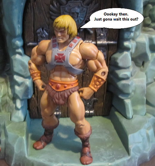
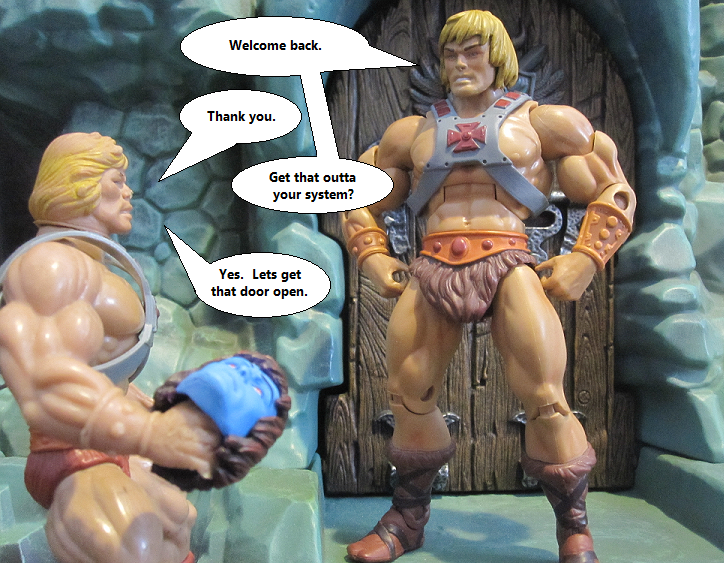
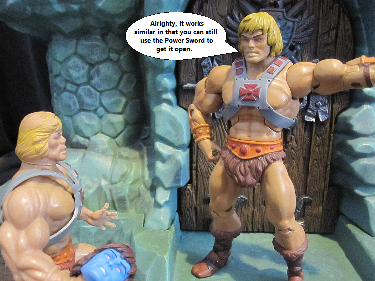
Now, of course, you can still open it up with anything that fits in the slot. No different from the vintage castle. It's just cool that the slot is so unassuming! If you were exploring this set for the first time, you could easily miss it. Perhaps it's not good for intuitive play...but screw it, I love that fact! An actual hidden feature, almost. (Even if it's a major and important feature).
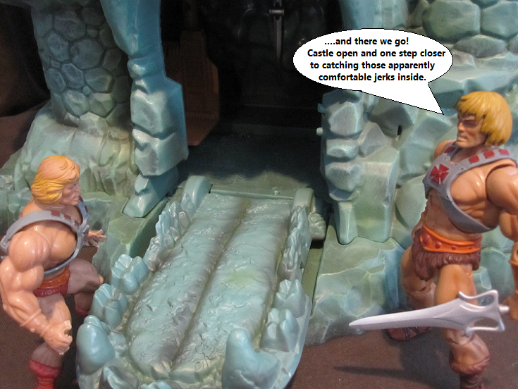
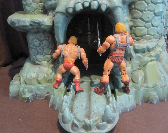
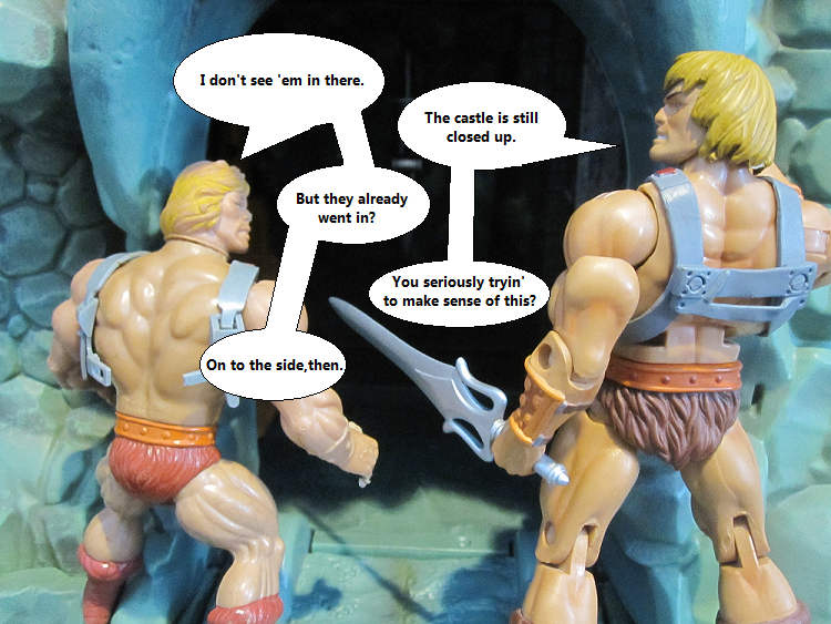
Just like the old castle: You can't get in that way until you crack open the clamshell that is Castle Grayskull. Lets follow them to the side to see how this works.
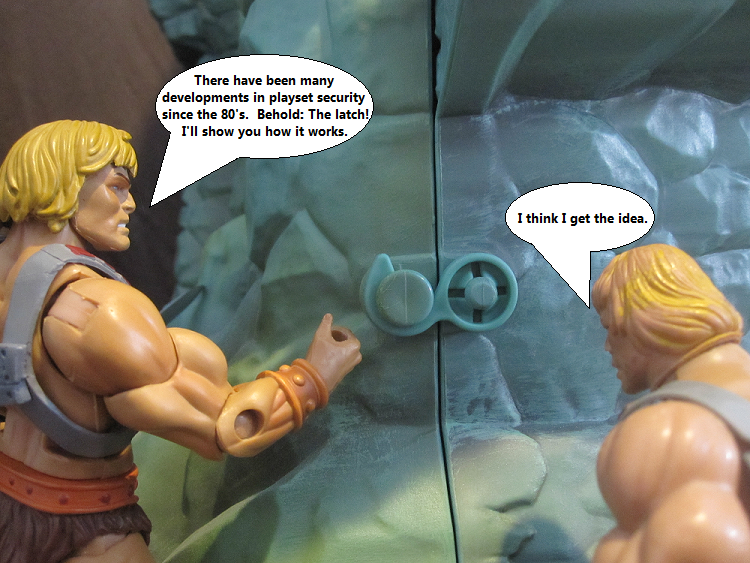
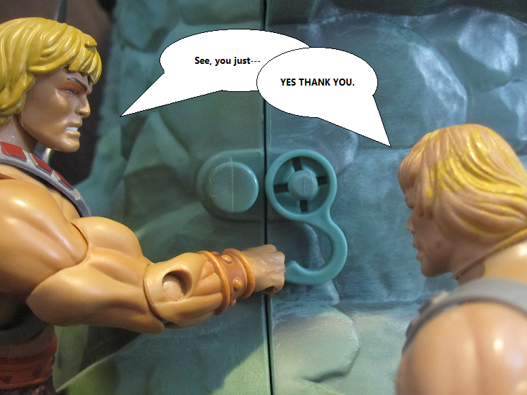
Simple latches! You'd think they would push up instead of down, but it works all the same. The latches click into place and won't fall down and risk the castle opening while you carry it. I like 'em better than the old tabs, since they have less of a chance of breaking off during regular use. I guess it would have been cool if the latches could have been molded to look like rocks, but EH. Works like it is. I'll take function over form, on this one. Especially since we have so much "form" already!
I'd still be in love with this thing if it were just a shell, because the closed up castle is just beautiful. It would be a crime to leave this thing closed, but I wouldn't blame you if you couldn't stop staring at the closed package. I wish I had a little turntable so I could have it slowly spin around and around, giving me a view of all the little details.
There were some concerns about the door clearance and He-Man not being fully able to sit on Battle Cat while in the doorway, but...I really don't care. As I said in Part One: I wouldn't want this thing to be any larger. It does what I need it to do while being on the edge of affordable (and by "affordable" I mean: If you absolutely love MotU and have the cash to put aside).
Keep it real, folks, 'cause you're gona need as much "real" as possible to combat all the unrealistic hijinks and over-the-top madness of the inside of the castle. Or, at least, what happens inside.
SKIP OVER TO PART 3!
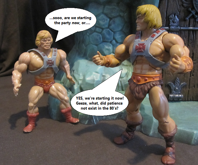
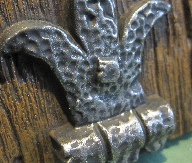


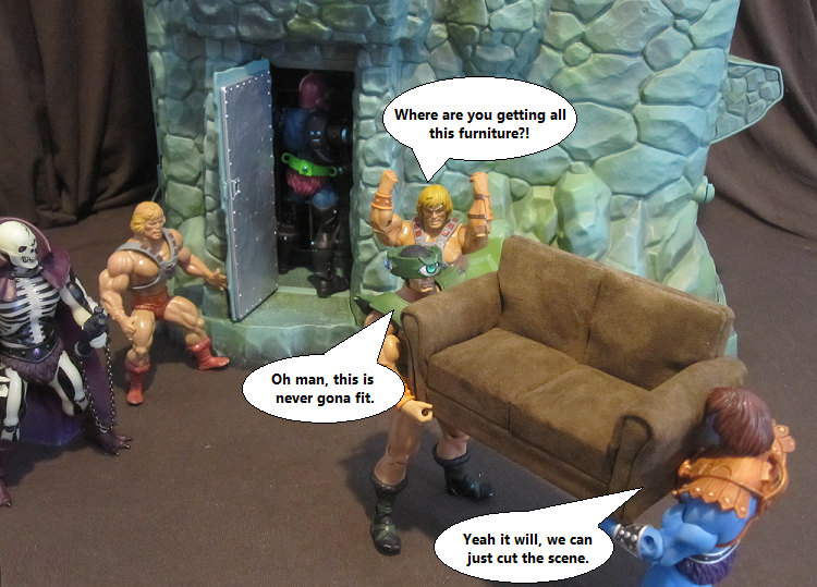
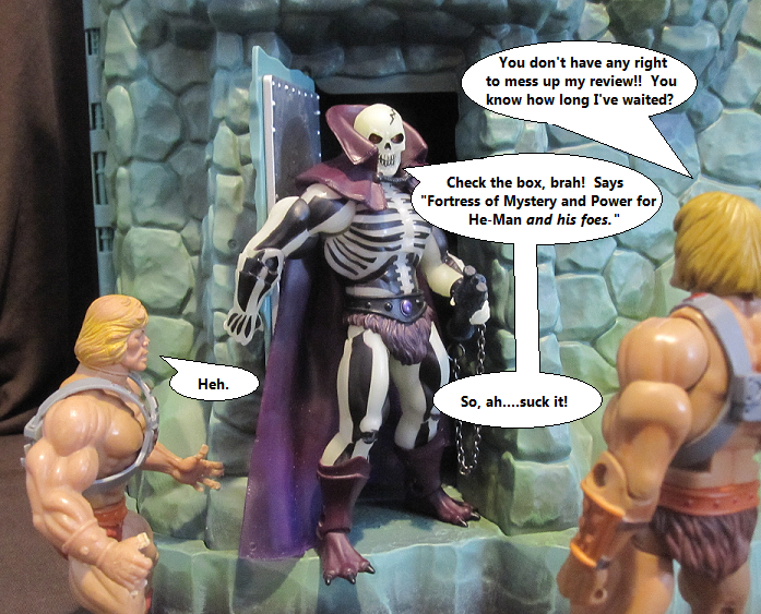
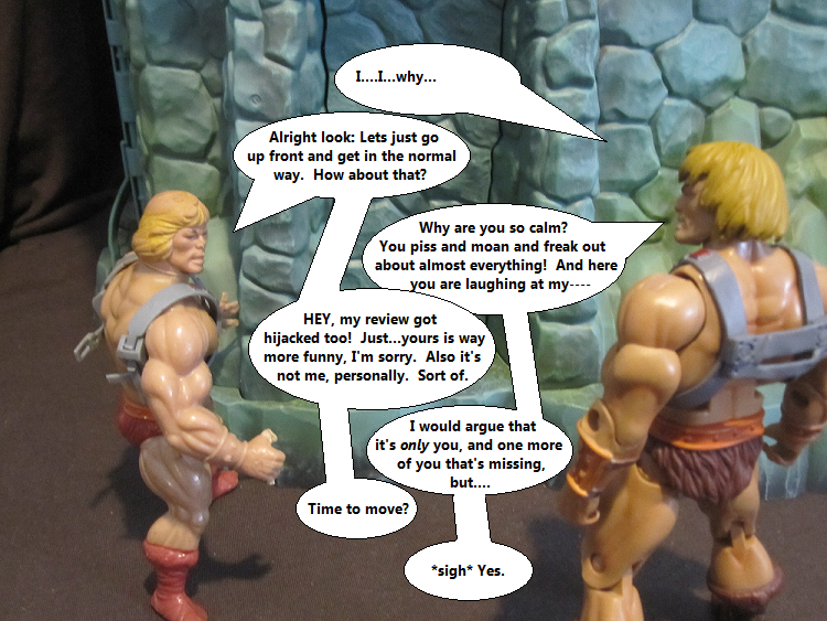



Hinge Benefits. That is way funnier than it should be. And never change that Geldor. Never.
ReplyDeleteHa! "hinge benefits" was a "Screw it" joke 'cause I didn't think it made any sense, but I wanted to move on.
DeleteAnd Geldor has pretty much stolen those sunglasses for good.
Loving it so far.
ReplyDeleteSomething that I really like, for no real reason, is that secret entrance and ledge on the second floor. It's just cool- like when someone needs to get away from it all and sit on the ledge under the stars, thinking about the big questions while the moon floats overhead. Or when someone needs to pee from a height. Good times.
Sadly, I've been so enthralled with the insides of the toy that I haven't closed it since I've gotten it, to play with the front and the outside that much.
There's always a reason to love secret doors! And yeah, I was thinking of the ledge in a similar fashion - ya know - if the castle were properly sized compared to the figures. Maybe you're walking by the castle at night and catch the Sorceress chillin' on the ledge, lookin' up at the stars.
DeleteDitto for closing it - it hasn't been closed since I took those pictures. It's too useful on the inside (plus, I don't feel like taking out the main floor again). I've also ALWAYS got toys hanging out in it that I don't feel like moving.
Those puns almost killed me, almost.
ReplyDeleteCan't wait to see the furniture and that motley crew moved into the castle.
I specialize in near-lethal puns, so of course you didn't die!
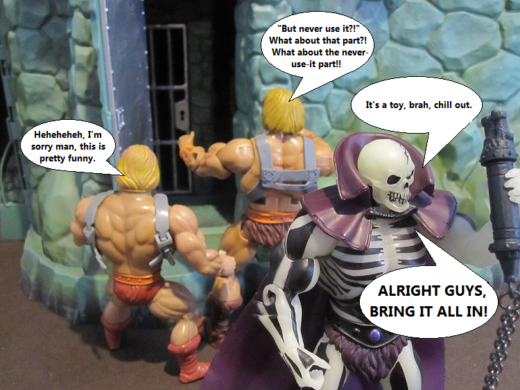
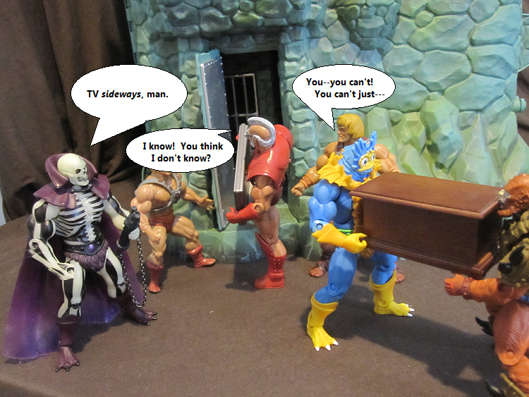
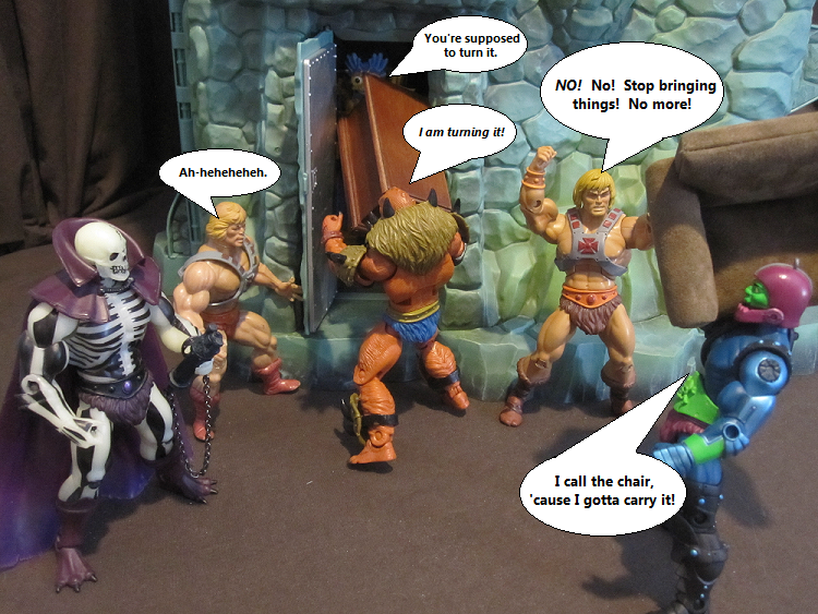
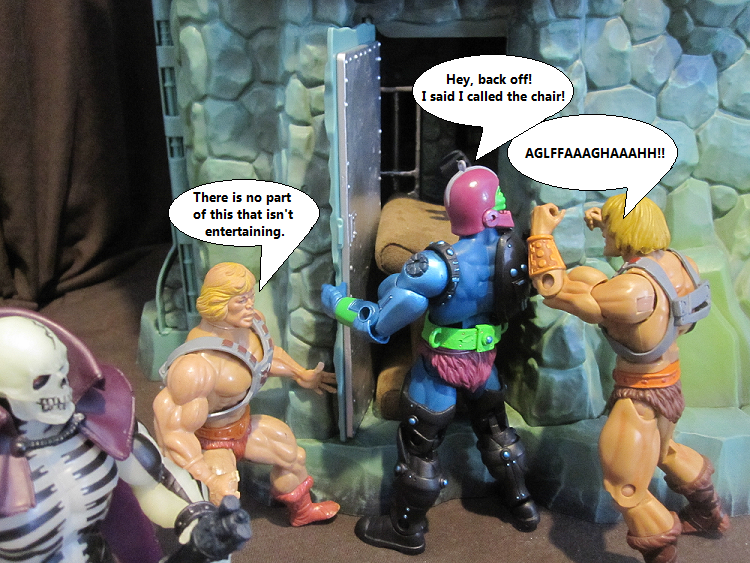
DeleteAnd yes...what ARE they doing in there?
Setting up for a future photo shoot and blog entry about props and goodies?
DeleteOh they're already well finished with that; I just need to give them words to say. This whole shebang will be done before next week is over with, I can at least guarantee that. Just need me some time to sit down with the pics.
DeleteFinally!! I've been waiting...what? A year for this? So cool. Thanks Alexx.
ReplyDeleteIt HAS been a year! A nice long year of me trying take pictures, then finally finishing them, then trying to sit down and edit said pictures. I don't really have any good excuses other than I watch a lot of Game Grumps instead of working on these.
DeleteAlexx reads Sweet Bro and Hella Jeff? I don't know how to react to this.
ReplyDeleteHomestuck was a HUGE thing for me, for a good while there, but I took a break around the end of The Scratch and the introduction of the second set of characters, and still haven't been back to catch up. I bookmarked it and try to stay away from the site (since it tends to change with big events) so I don't spoil anything. Still listen to the soundtracks, though. And Sweet Bro and Hella Jeff are never gona leave my brain.
DeleteYou know, in that one pic where they're just starting to talk about the sword hole to get into Grayskull, I was like "Isn't that a little slot right there?" I'm one for intuitive play! Look at how smart I am!
ReplyDeleteI also noticed that there's a walrus face on the back of the castle. It's the section with the hidden door and the two li'l windows above it. That is a walrus face. Specifically, it looks like Wally Tusket from Ultimate Muscle. Ha! Can't unsee it now, can you!?
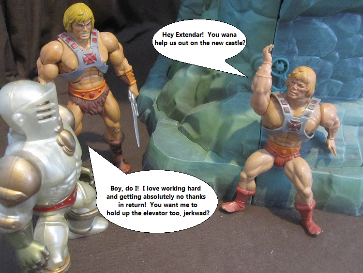
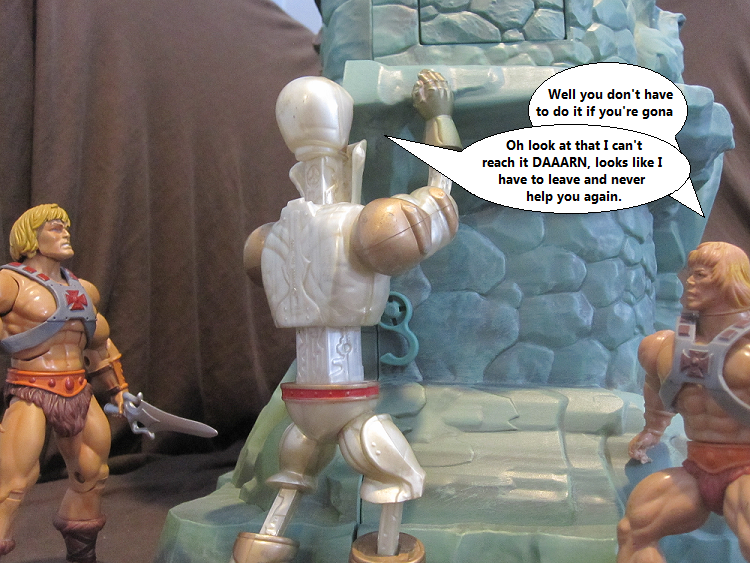
And this might be besides the point of the spotlight, but I never noticed the vintage Extendar had curved extending arms. I never had him, so I just never knew. Makes sense, what with the shape of the vintage arms. Looks pretty cool too.
Anyway, I'm loving the details on the outside of the castle. Looking forward to what's on the inside (it's what's on the inside that counts, after all).
Yeah, I suppose it is a bit more obvious than I let on in the review. Still, I love it!
DeleteHA. I see it.
Yeah, vintage Extendar has some pretty satisfying joints. You know what I mean? Those joints that are fun to move.
Yes, the inside is always what counts! IT'S WHAT KEEPS US ALIVE.
*falls off ledge again*
ReplyDeleteIT KEEPS HAPPENING